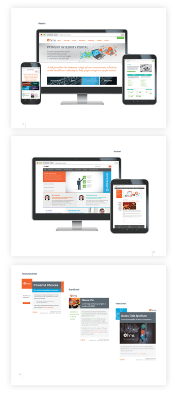
Overview Video
An overview video launched the brand to the new market and existing customer, and became a prominent feature on the redesigned website for the first six months.
Internal Launch Videos
An introduction video to the new face of HMS was created for the internal launch of the rebrand along with a video highlighting some of the new changes. Both videos were shown at brand reveal celebration in addition to being featured on the revamped intranet.
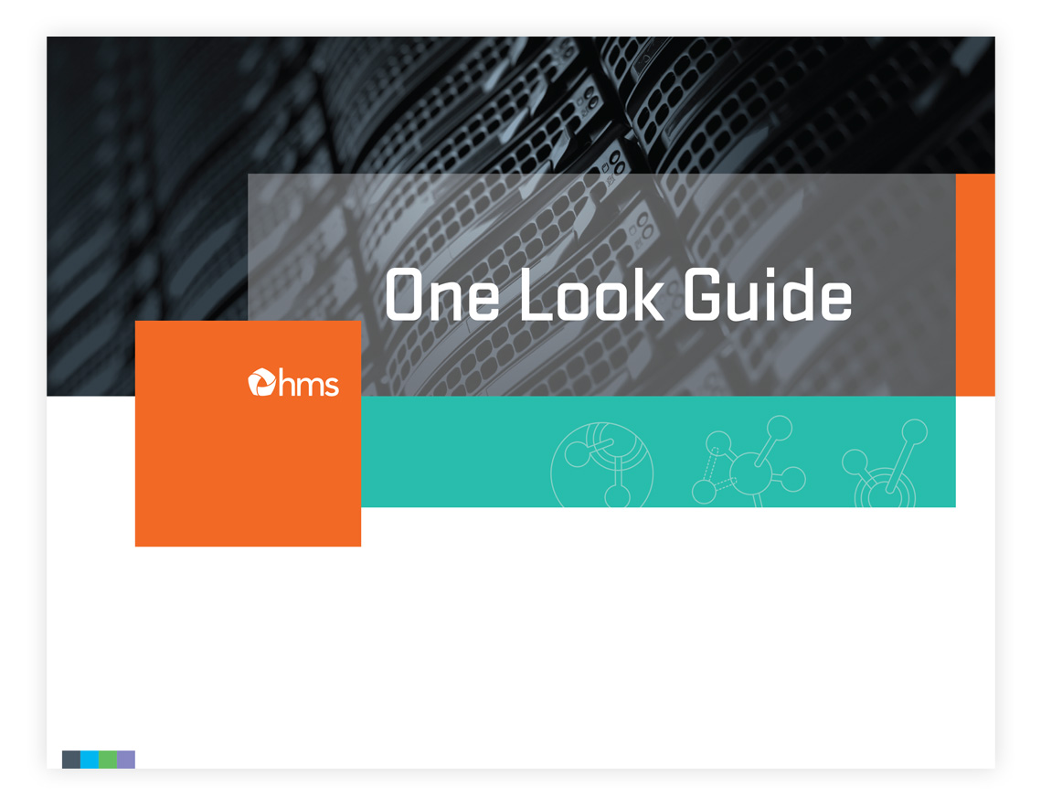
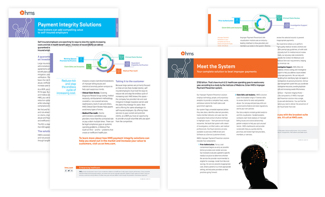
One Look Guide
A robust brand style guide was developed and featured on the marketing and communications section of the company intranet to provide a consistency to the new HMS.
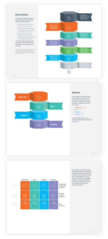
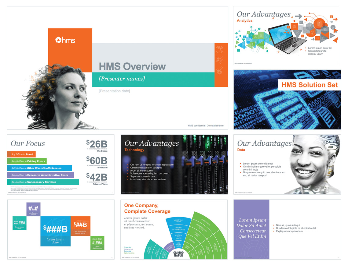
Sales Materials
Case studies, sales sheets and product sheet templates provided the sales team tools for tradeshows and meetings. Robust presentation templates promoted consistent branding for pitch meetings. Color-coding made it easy to delineate the four markets at a quick glance, while icons focused on the three service lines.
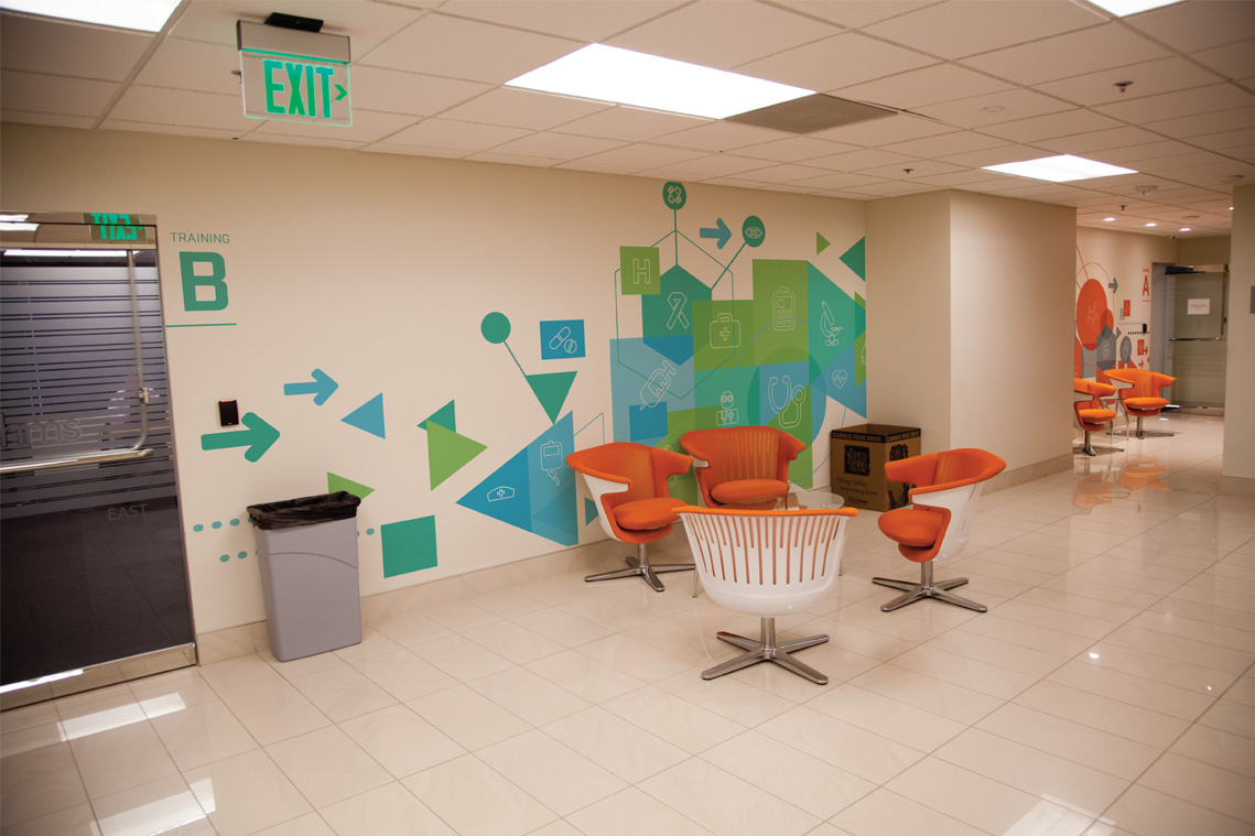
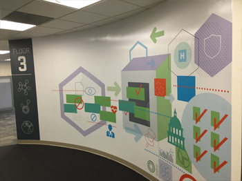
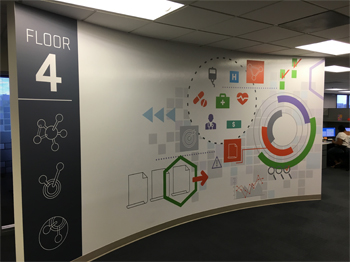
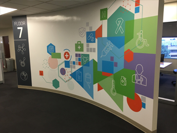
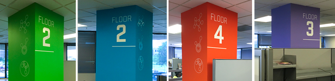
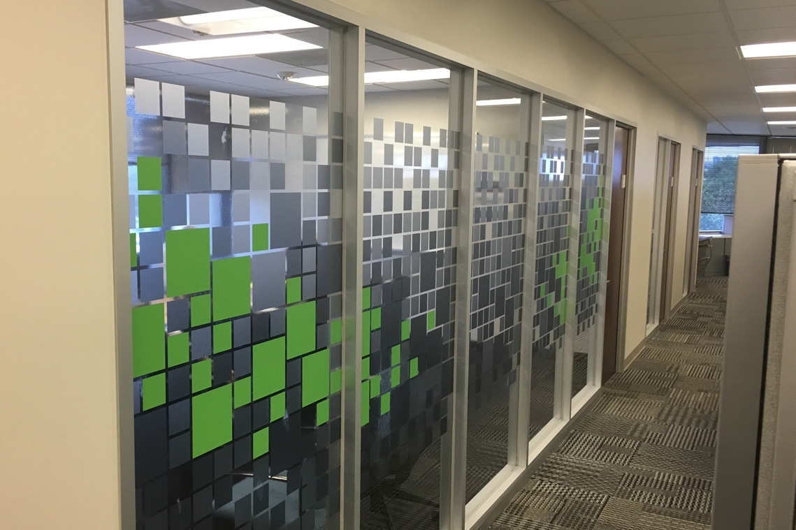
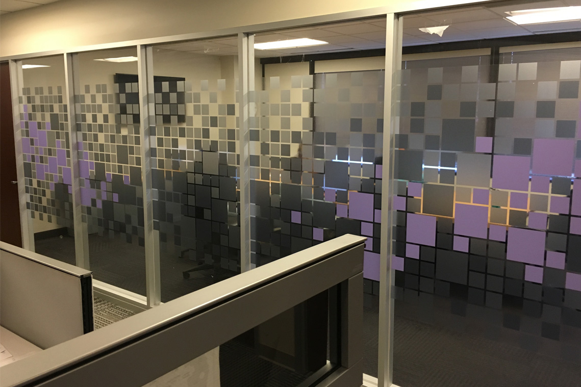
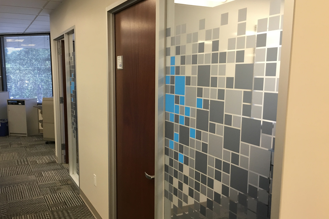
Environmental and Way-finding Graphics
For the ten-story headquarters in Las Colinas, Texas, the brand was introduced into the stark workspace adding color and reinforcing the one company message. Color was also used as way-finding with each floor divided into color-coded quadrants. Conference rooms and offices followed the same pattern, so it became easy to find the blue conference room on the seventh floor or the someone in the purple quadrant of the third floor. A couple of directors said they saw a rise in morale from the introduction of color, images and messaging in their work areas which was an effect we hadn’t anticipated.


- Creative Director: Tad Dobbs
- Copywriters: Julie Shultz, Brad Cope, Francesca Marraro and Ali Adams
- Designers: Tad Dobbs, Adrian Garza, Allie Trimboli and Randy Padorr-Black
- Video Editing: Chris Fumerola
- Agencies: Peterson Ray & Company and Magic Production Group