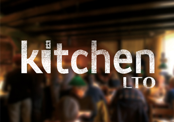
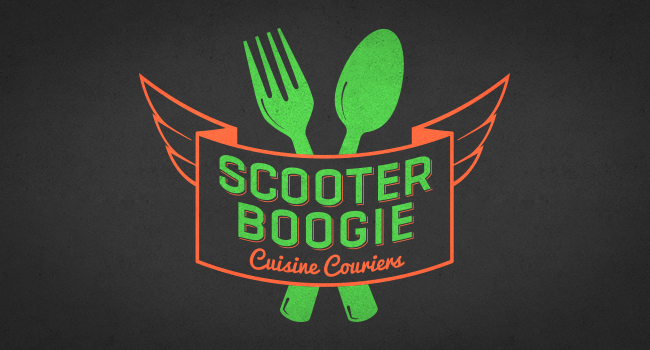
BRAND STRATEGY
Kitchen LTO


Find Out More

Dallas's First Permanent Pop-up Restaurant


Located in the Trinity Groves area, Kitchen LTO is a unique restaurant concept that changed chefs and menus every quarter. Chefs would receive votes on social media based off of exclusive tastings to determine the new flavor of Kitchen LTO. Early planning would have the interior design of the restaurant changing in addition to the menu and chef. The challenge was to build a great anchor brand that could be Tex-Mex one quarter and Asian fusion another.

Logo

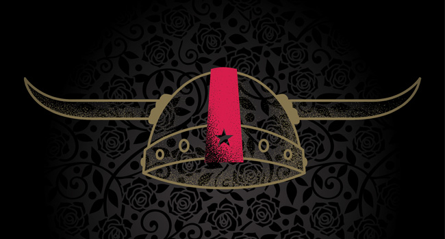
Simplicity drove the design to focus on the chef’s knife as the central element to all cuisine options.
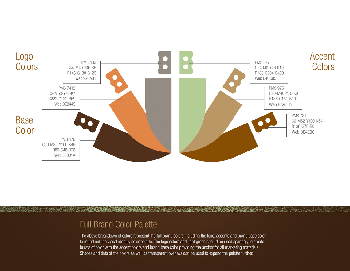
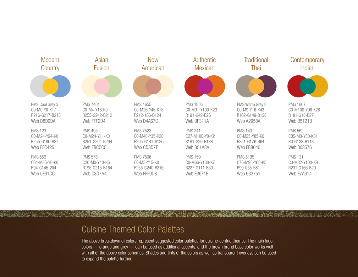
Kitchen LTO logo with chef's knife logomark

Colors

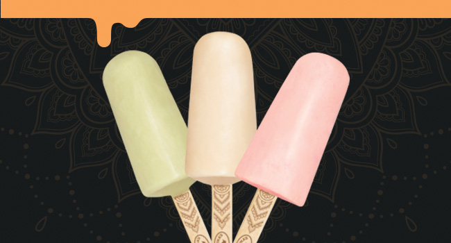
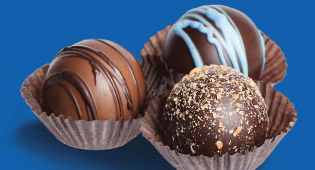
Orange, warm grays, deep browns and mint green created a flexible foundation of brand color to work well with whatever cuisine color palettes might come.
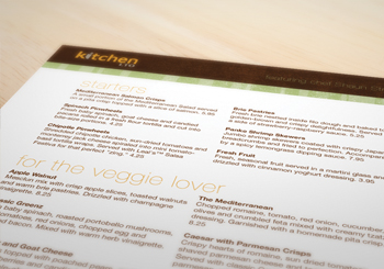
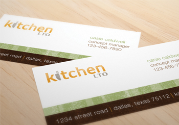
Brand color palette featured on illustrations of chef's knives Dallas and Addison Social Media Day 2017

Application

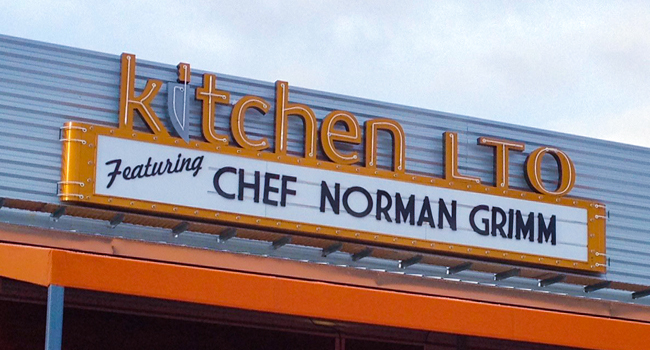
Examples of menu design, window vinyl and business cards helped visualize how the colors and brand would come to life.

menu design
window vinyl at busy restaurant
buisness cards

Let’s Set Up a Meeting


Give me a call or send an email, and I will get back to you as soon as possible.

214-244-5011